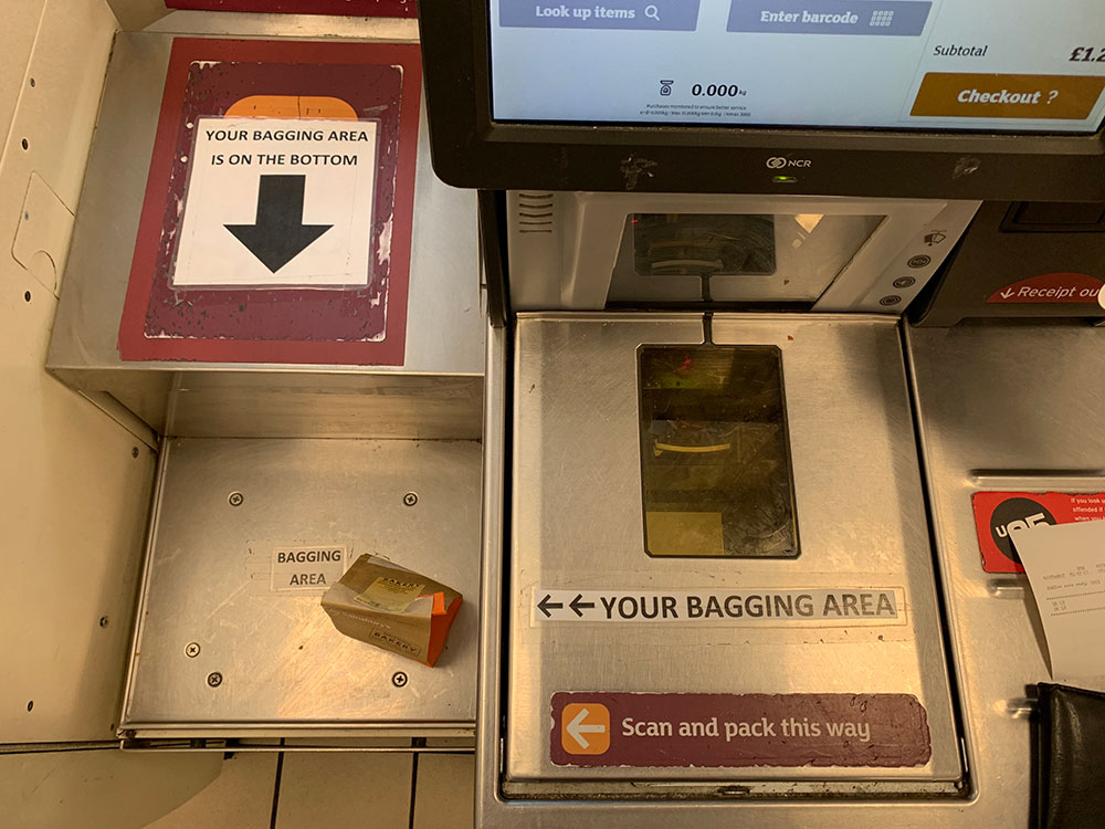
So I’ve written about the experience of using checkout tills before, but I have to say I’ve struggled with many aspects of these ones. The whole way that the bagging area has been designed suggests to me that this was not user tested. I previously decided not to comment on that in case I was wrong, but this week seeing all of these extra ‘hints’ show up prove that it’s not just me!
It could also be an analogy for “doing the UX” after the build, and skipping on the research.

