I read a lot of books, I love a good magazine, and I am really partial to the design of the Weekend Financial Times. Print has advertising and marketing content but that doesn’t detract from the reading experience, indeed they can even make the product feel more premium.
What if reading a print magazine was like this?
You pick up a magazine which is wrapped in a really ugly advert, and as you rip it open it starts to flap around in your hands as if a mysterious wind has blown into the room.
Small adverts jump out at you each time you turn a page, and fall to the floor. All of the adverts are for baldness cures. Sometimes the pages are blank with grey boxes on them.
As you start reading an article the phone rings with an offer to buy 10 more magazines for the price of 9. Exhausted, you look out the window and it turns out somebody followed you home from the newsagents and they are looking to see which pages you spent the most time reading.
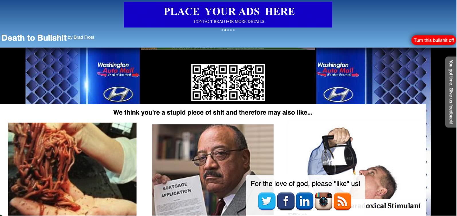
Welcome to modern websites
When I try to read something online, an article that takes more than a few seconds, then the experience is often horrible. Most layouts are unimaginative and look the same, and the amount of ads and other upselling devices that load in constantly make it almost impossible to read something in a smooth and tranquil motion.
From simply bad and inaccessible typography, to layouts that constantly shift around due to lazy loading and other reasons that are not for the benefit of the reader, to those irritating adverts that stick in the background whilst you try to scroll past the inappropriate advertising, to chatbots insisting on helping you, to surveys…the list goes on. Monstrous experiences being powered by Javascript frameworks that spit out ugly markup and hog your bandwidth, which ultimately have not improved the reading experienced but have actively harmed it.
This is the experience much of the time.
Does it have to be this way?
I get the economic arguments – you need advertising because you need to pay staff and cover your expenses. And often they will put up with a mediocre experience if all that they are reading is mediocre content, designed to entertain them for a few minutes.
But I do think there is room for improvement.
Developers have to take a long hard look at themselves and ask whether current frontend frameworks are benefitting users as much as it is benefitting their ability to work fast. We’ve seen a huge shift to React and loading everything through Javascript, but I just can’t see the benefit for somebody wanting to read and consume content. My needs have not changed in 20 years – I just want to read the content, look at some quality images and video without feeling twitchy.
The way that advertising and upselling is being shown to readers is really badly designed. Let’s back to the drawing board. And we can use a little more imagination and use CSS to create really great, fast-loading and widely supported layouts and typography.
I think the web is failing people that like reading, and we should stop travelling down the same road. It would be so great to see the experience become a pleasure, where the experience between reading print and digital becomes much closer.