
CRU is a business intelligence company, and they have an online platform which subscribers use to access articles and data about commodities based on research and expert knowledge from analysts.
Outcomes
~ 40% increase in platform use after relaunch
New product features to help increase platform subscriptions
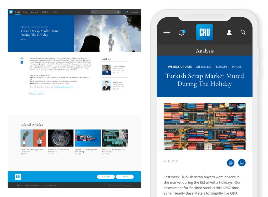
Small screen engagement increased
Improved internal workflows to cut production costs
Showed the value of Usability Testing
GenAI pilot Product Strategy and Design
How can we bring subscribers back to the platform?
- Many users were relying on information sent them in email communications
- Editorial teams needed improvements to their workflows
- Analysts needed a better search experience for finding key intelligence

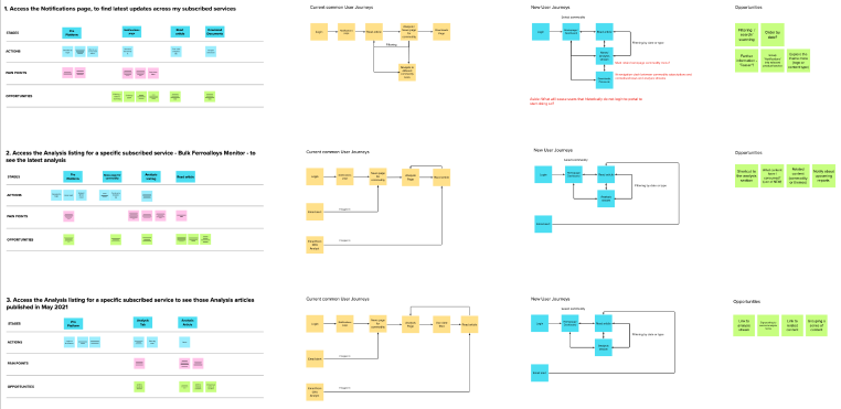
Research and User Journeys
I looked at Analytics Data, referred to customer support issues and interviewed users. Then I drafted some proposals for better user journeys.
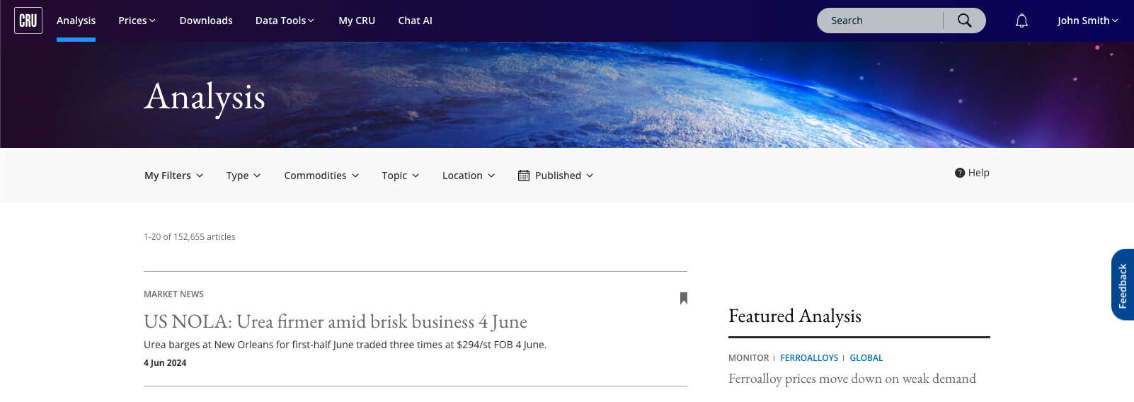
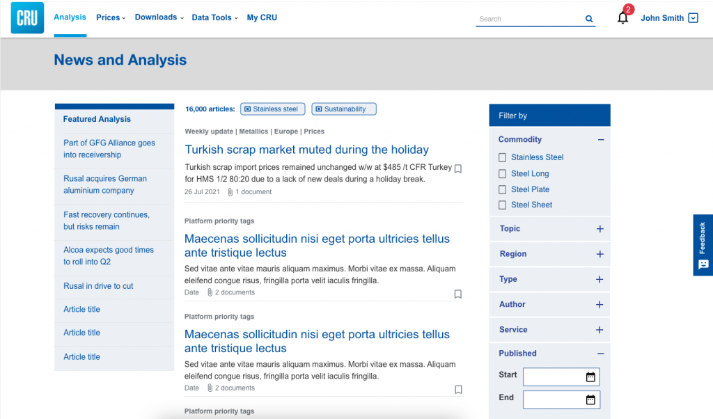
Redesigning the Content Model and IA
The platform was suffering from content was being siloed in a strict hierarchy in the site, with a lot of cross publishing and duplication. Therefore I proposed a model to allow more flexible ways to find and organise content.

Content Strategy
I also identified the need to codify and implement a content strategy. I explained that this was needed to support:
- Getting essential content to users at the right times
- Successful IA and design
- A more efficient and effective workflow for internal teams

Prototyping user journeys
Based on the above work, I drafted up a new sitemap and I worked with stakeholders and users to validate a wireframe prototype to communicate what the experience of navigating the site would be like.
Business Goals and Metrics
To formulate a good analytics strategy, I set out a brief guide and rationale for what was needed from a UX perspective. This included revisiting the major business goals and thinking about People, Process, Tools and Measures:
- People – who will manage, interpret and most importantly take actions with data
- Process – the process of report and alert distribution
- Tools – choosing the right analytics tools and integrating the data
- Measures – information overload is the challenge – finding the right measures to use in dashboards, alerts and for optimisation is needed to get the most from analytics
I then took the HEART analytics framework from Google Ventures and linked each aspect with the business goals, what signals to use and the metrics that we would then be able to measure desired business outcomes.
Usability Testing
I was also looking to bake in usability testing into our sprints, so that we would get early feedback from users, and get some early seeds growing for platform champions and changing the client mindset to a user-centred one. I also wanted to have usability testing and research as part of adding new features and services to the platform as the product matures.
Design system and Agile build
Following all this work I then worked with a visual designer to create a new visual identity and UI patterns and components for the platform. I wanted the engineering team to feel fully involved, so they joined us through the design process, and together we produced all the assets and specifications they would need to implement the new UI.

After the initial design phase was completed, I took on the role of breaking out, managing and expanding the Design System and working with our developers to optimise consistency and accessibility.
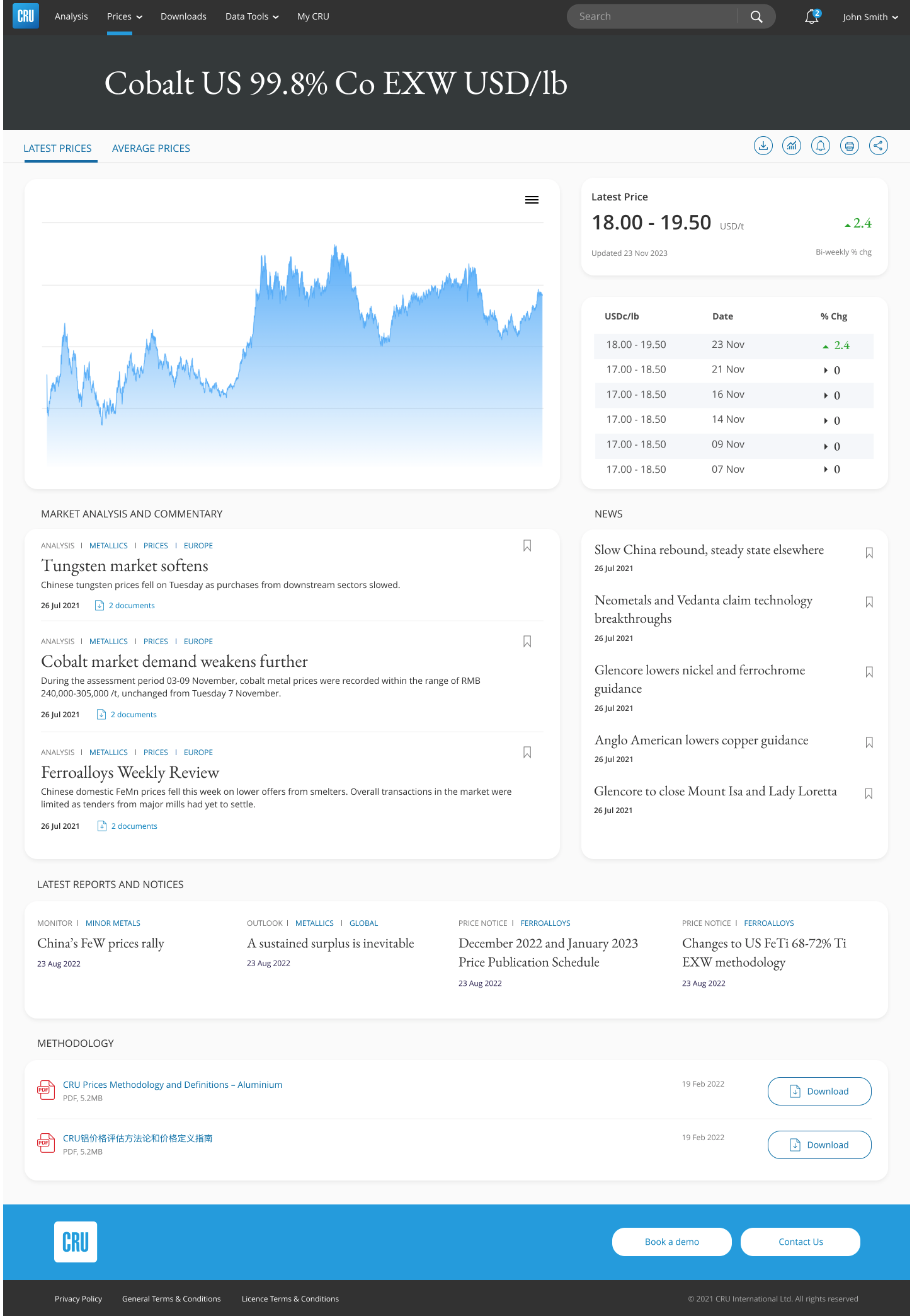
Dashboard and data cards design
New product features that I am proud of are the design of commodity dashboards and data cards.
I worked closely with the client to research ideas, I then also ran some user research sessions to uncover what information clients need regularly at a glance. We co-created dashboard wireframes which we then workshopped with the whole team to make sure that all necessary content could be delivered.
That allowed me to design some scalable, interactive dashboards and data cards that would become a big selling point for new subscriptions.
More case studies
Brand Union
Increasing business referrals for a global agency website