

The Manifest Editor is an open source tool that organisations and individuals can use to assemble and organise collections of images, text, audio and any associated metadata. This creates a JSON object that can then be used to output anything from a slideshow to a website. It is used by places such as The Getty, V&A and several European universities.
Find out more about the tool and it’s ecosystem.
Updating the product design for a popular open-source editing tool
As the tool gains traction, the community and organisations that support its development wanted to review the UX of using it. It had grown organically, often developer and stakeholder-led, and so it had started to lack consistency and usability. The editor would first need to be set on a solid UX Design foundation, and then the product roadmap could be approached in a methodical manner where we build out the UX and capabilities.

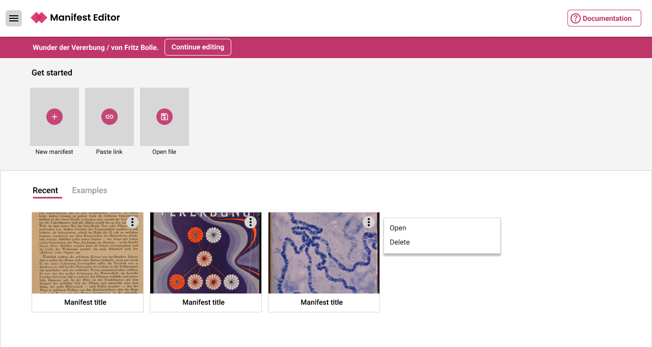
The landing page assumed a particular user journey and scenario for workflows, and the interface felt unbalanced.
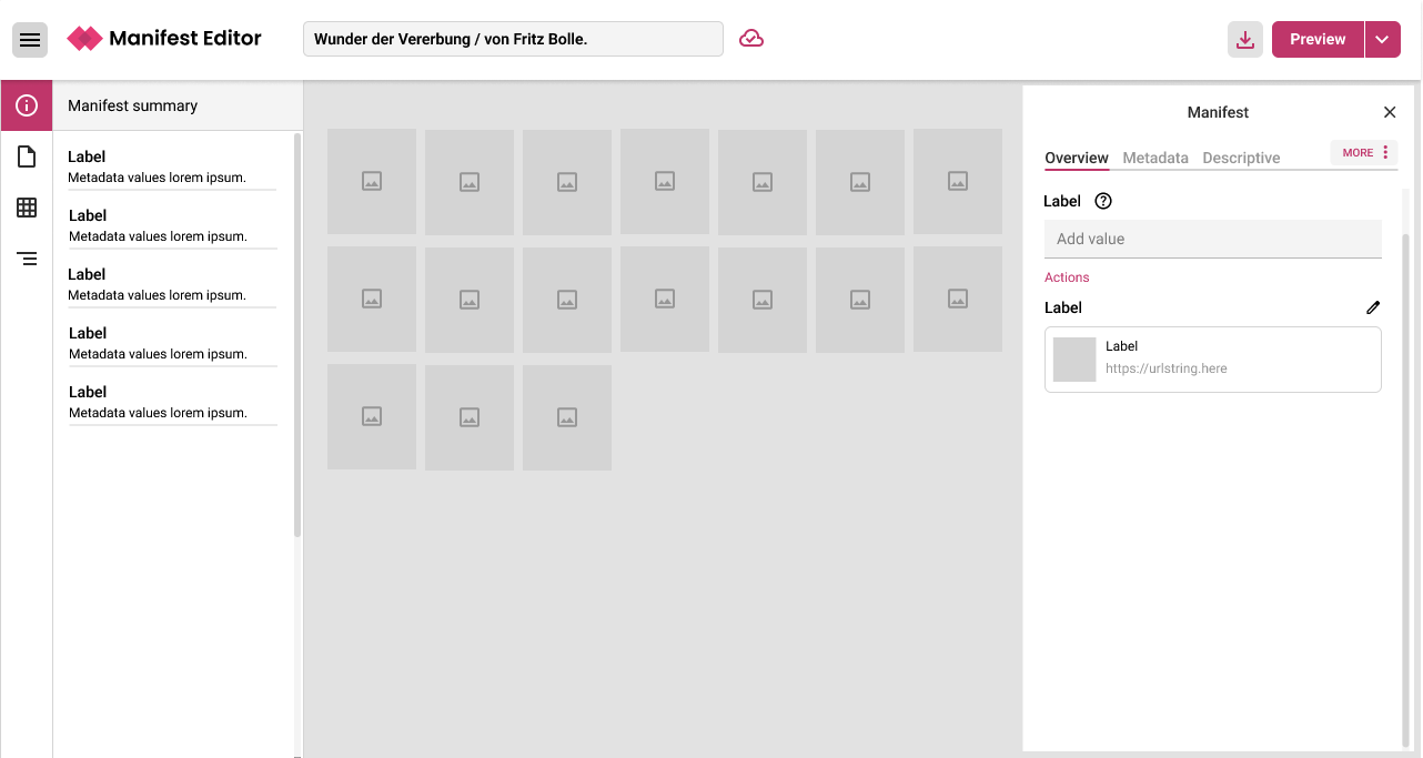
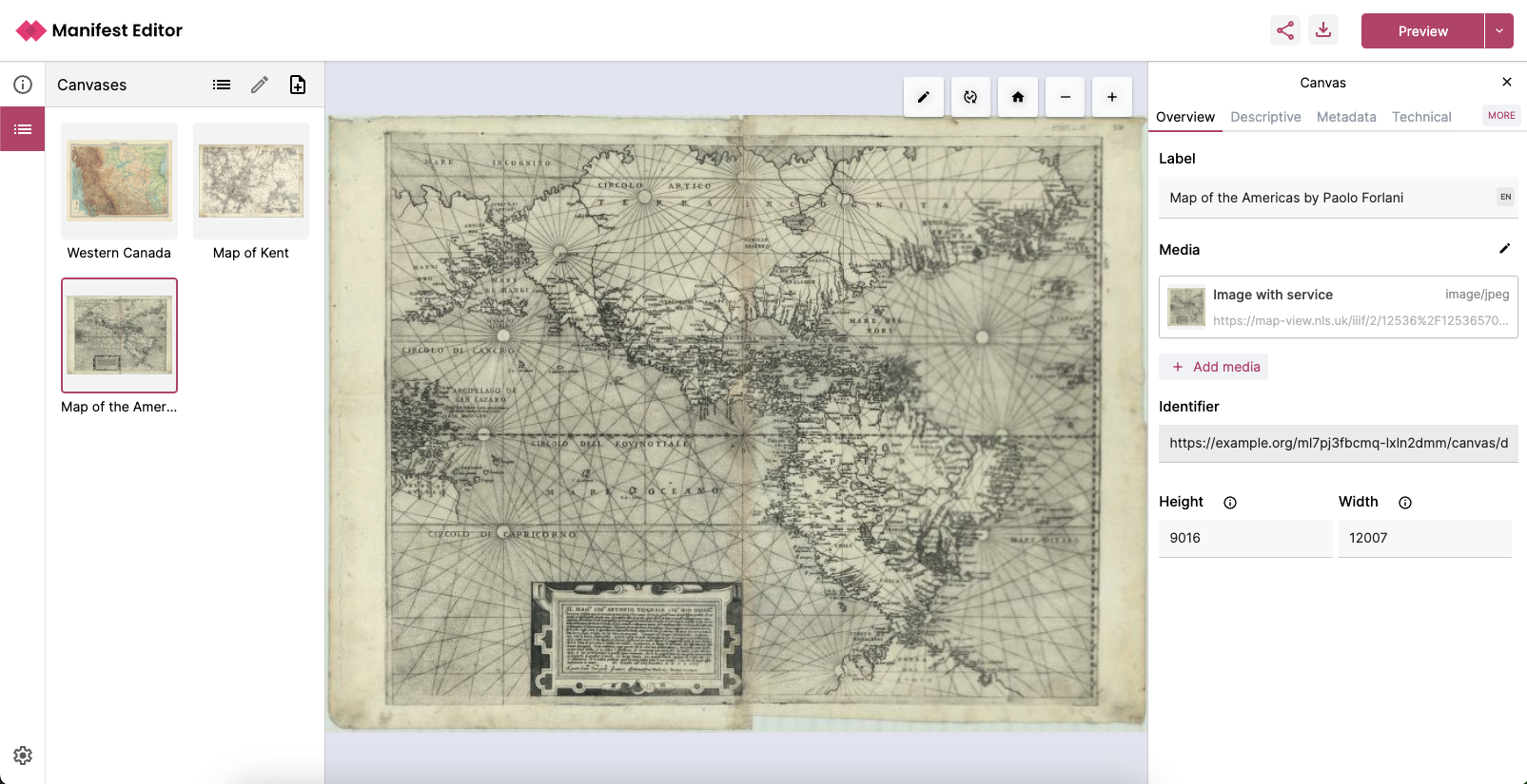
The general editing interface had some usability issues, and needed more consistency in it’s UI design patterns.

Reviewing the brief
I started with reviewing a Statement of Work that had been created previously to see if the UX work proposed made sense and needed any amendments before it was signed off. I clarified the work around creating a new design foundation, including building out the design system on a limited budget. Often I work with UI Designers to craft these, but this time I took the task on myself.
Most crucially I added more discovery into the process, mainly around a quick round of Usability Testing and stakeholder and community feedback to identify the key problem areas to focus on for the first phase of the redesign. I also carried out a quick Heuristic Review of the editor to identify what I thought were the main issues in the UX.
Then I worked with the team, PO and stakeholders to prioritise the order of work to be carried out initially.
The key issues, on a high level were:
- Difficulty understanding UI labels as they were based on technical language
- Inconsistent UI behaviours during workflows
- Trouble understanding information hierarchy in the workflows
- Lack of system feedback and helpful guidance
- Basic usability issues
A new styleguide and design patterns
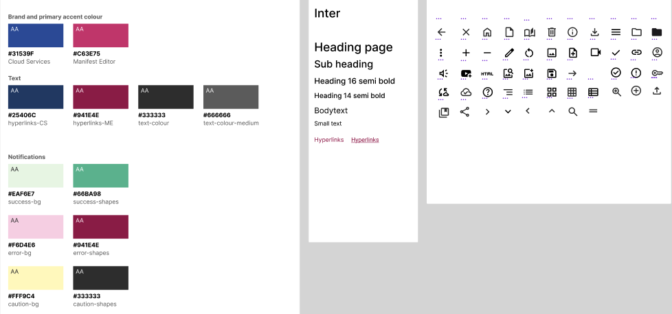
First I wanted to establish some consistency by defining an accessible colour palette and the typography in terms of typefaces and scales. I used Figma.
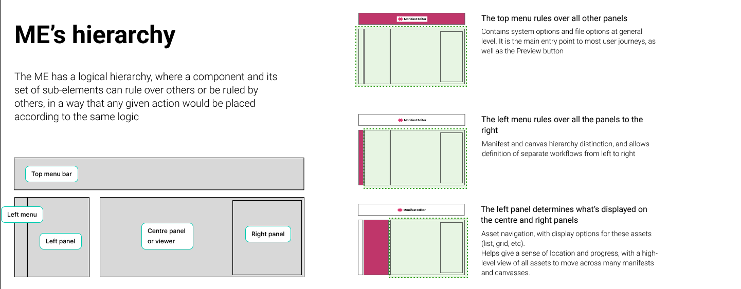
Then I set out high level interaction conventions for the editor interface, and started to build out the main layout, and components in the interface. Fot the first phase, I felt that focusing on these areas would bring big improvements without adding too much complexity to the product:
- Solving the Information Architecture and hierarchy issues. One key factor was a clearer navigation system to make workflows and the information hierarchy clearer to users.
- A more usable design resulting from clean minimalist design, clear controls and workflows, and removing superfluous and difficult language from the interface
- Including more system feedback and communicating status and giving guidance
The conclusion to this phase was presenting the designs to our stakeholders, to get the green light for development.
Agile build and iterations
Next we began an agile development process, where I worked with our development team to consult and discuss on any issues or limitations that presented themselves during the rebuild.
Usability and accessibility testing
As part of the overall product development process we carried out further Usability Tests to test each new major release to the product, and part of our community team worked with us to thoroughly test and identify accessibility issues. We then took any issues back into the backlog and discussed how to prioritise work on them.
Outcomes
We showed and allowed people to try our initial work at a large IIIF conference in Los Angeles, and gained extremely positive feedback! Our main client has also started integrating the tool into their workflow, and the teams are finding it much easier to use and are spending less time updating manifest metadata.
We continue to gather feedback from user groups and clients who will use the editor as part of their IIIF digitisation workflows. Overall the consensus is that:
Using the editor now is so beautifully simple – we’re excited for the next steps!
client